Creating an effective shopping page involves multiple things working in concert to generate the most interest, and ultimately conversions to sales. In a post on optimizing product pages for performance, Shopify identifies four key elements of a shopping page: product, brand, copy, and page design/user experience. The article goes on to outline 11 strategies to keep in mind in optimizing these elements for shopping page performance.
Below, we highlight and expand on a few of these suggested strategies, which we feel to be most beneficial. While helpful concepts for all online marketers, application of these strategies will be especially beneficial for online sellers who want to build high converting shopping pages.
Have a clear call to action.

Your primary goal it to get your visitors to “add to cart” or “buy now”. The best way to do this is to make sure that your shopping page visitors see a call to action button front and center.
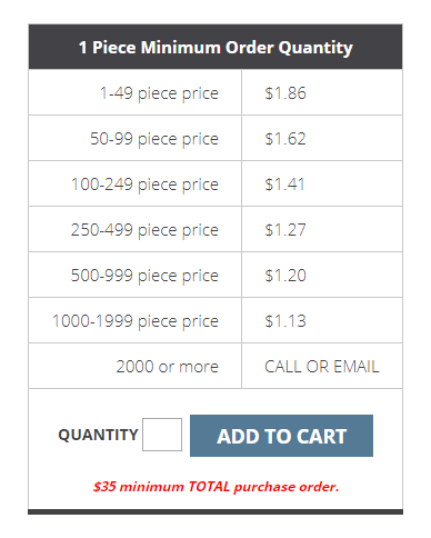
According to an article in Forbes, the most effective CTAs are “impossible to miss.” They say no particular color is necessarily more effective, but strongly contrasting colors are most noticeable. In the example on the right, the contrasting “ADD TO CART” button stands out from the rest of the text due to the contrast, weight, and size of the font on the button. The eye goes to this button first, even before the minimum order text in red.
Include quality product images.

Make sure that the product images you use on your shopping page are professional looking images. Bad lighting, poor resolution, and distorted angles are just a few things that can ruin your product shots if you don’t invest your time or budget in creating quality images. Low quality images can convey the message that your business is not a serious, professional organization.
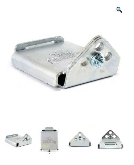
Depending on the nature and complexity of your product, it might be a good idea to have multiple views of your product, or the option to zoom. The example on the right shows multiple views and a zoom option.
Include aspirational messaging.

Aspirational messaging makes a connection between your product and the prospective buyer. Descriptive copy written in an aspirational way shows the reader how your product meets their specific needs or solves a problem for them.
In the example on the right, the headline anticipates a specific user need instead of just identifying the product. The reader immediately knows who benefits from this product without reading the fine print.
Include social proof or testimonials.

A prospective buyer browsing your shopping page may hesitate in making a purchase for a variety of reasons. If they are a first time buyer from your site, trust and uncertainty about your company may drive that hesitation. Seeing a review or testimonial on the shopping page can inspire the confidence buyers need to go through with the purchase.
According to Spiegel Research, displaying reviews can increase conversion rates by 270%. The example shown appears on a page promoting a particular service offered by one of our clients. While not a shopping page, the effect of motivating trust is still the same.
Have a good understanding of your customer.

In order to effectively use these strategies to create a high converting shopping page, you need to gain a good understanding of your customers. What product features do they value most? What questions do they most often ask? What problems are they trying to solve or what needs do they have when they visit your site?
At Upright, we use our buying insights strategies to gain valuable customer insights for our clients. We have found this process extremely helpful in developing highly ranking and high converting websites.
Contact us today to discuss how we can help you optimize your online marketing!

